The story behind the Arcus’ rebranding
A journey of growth, unity, and clarity
Over the past months, we’ve been on an exciting journey: a full rebrand of Arcus Group. We started internally in June and shared it with the world in November, with a fresh website and a redesigned tradeshow booth. But this isn’t just about visuals, it’s about who we are today and where we’re headed tomorrow.
Why we rebranded
Arcus has grown fast across Europe, bringing together our entities under one group.
With that growth came a big opportunity, and a need, to unify our identity. We wanted a brand that clearly shows who we are:
Europe’s fastest-growing steel resource
Stronger together, with our teams in Belgium, France, Germany, the Netherlands, and Switzerland
Built on trust, reliability, and long-lasting relationships
This rebrand isn’t about changing what we do. It’s about showing a clearer, more unified Arcus to our customers, partners, and teams across Europe.
Designing the Arcus identity
Once the “why” was clear, the next step was the “how.” Our new identity had to reflect the values that define us every day: precision, reliability, modernity, and unity.
At the heart of our new look is the Arcus brandmark, five circles that represent the unity of all Arcus entities, while subtly reflecting the precision of steel tubes.
These “Arcus Circles” flow through patterns, movement, and visual structures across our brand, reinforcing our strength, unity, and momentum. At the core is a simple message: Together, every step of the way.
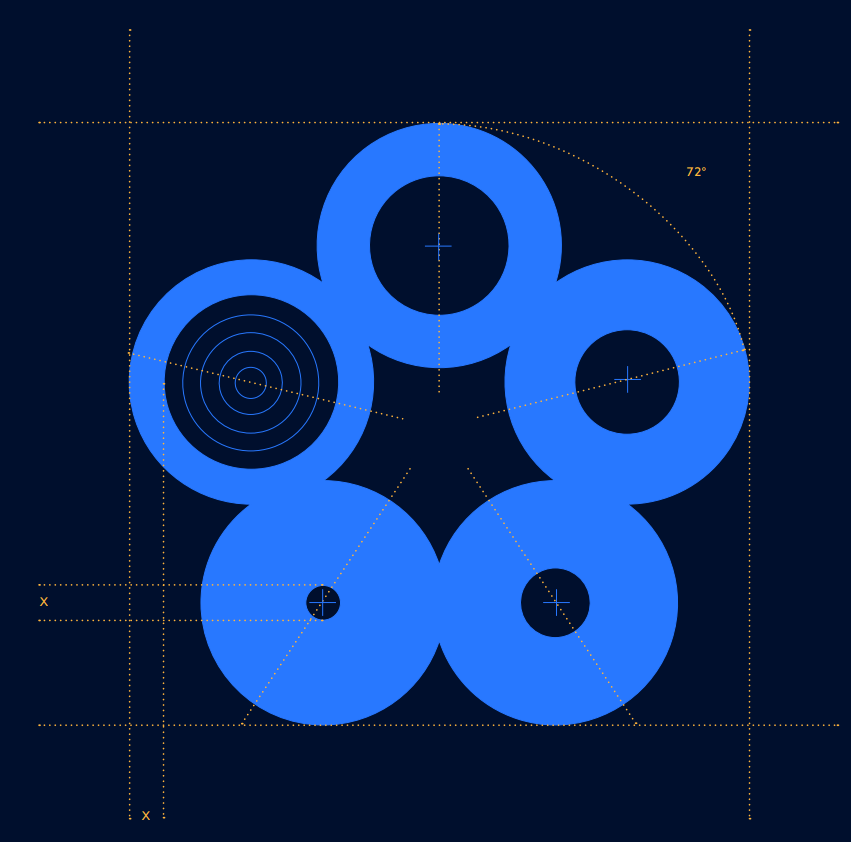
Arcus Group brandmark
Colors were carefully chosen to send the right message at a glance:
Blues → trust, professionalism, reliability
Oranges → energy, warmth, the glow of heated metal
Greens → our commitment to sustainability and ESG goals

Arcus Group Colors
Bringing the brand to life
With our identity ready, we brought it into the world. Our website got a full redesign to be clearer, more user-friendly, and to better tell the Arcus story. Modern visuals and intuitive navigation make it easy to see our unified presence across Europe.
The rebrand came alive at our tradeshow booth too. Bold colors, circular elements, and our emblem created a cohesive, memorable space that truly captured the essence of Arcus.
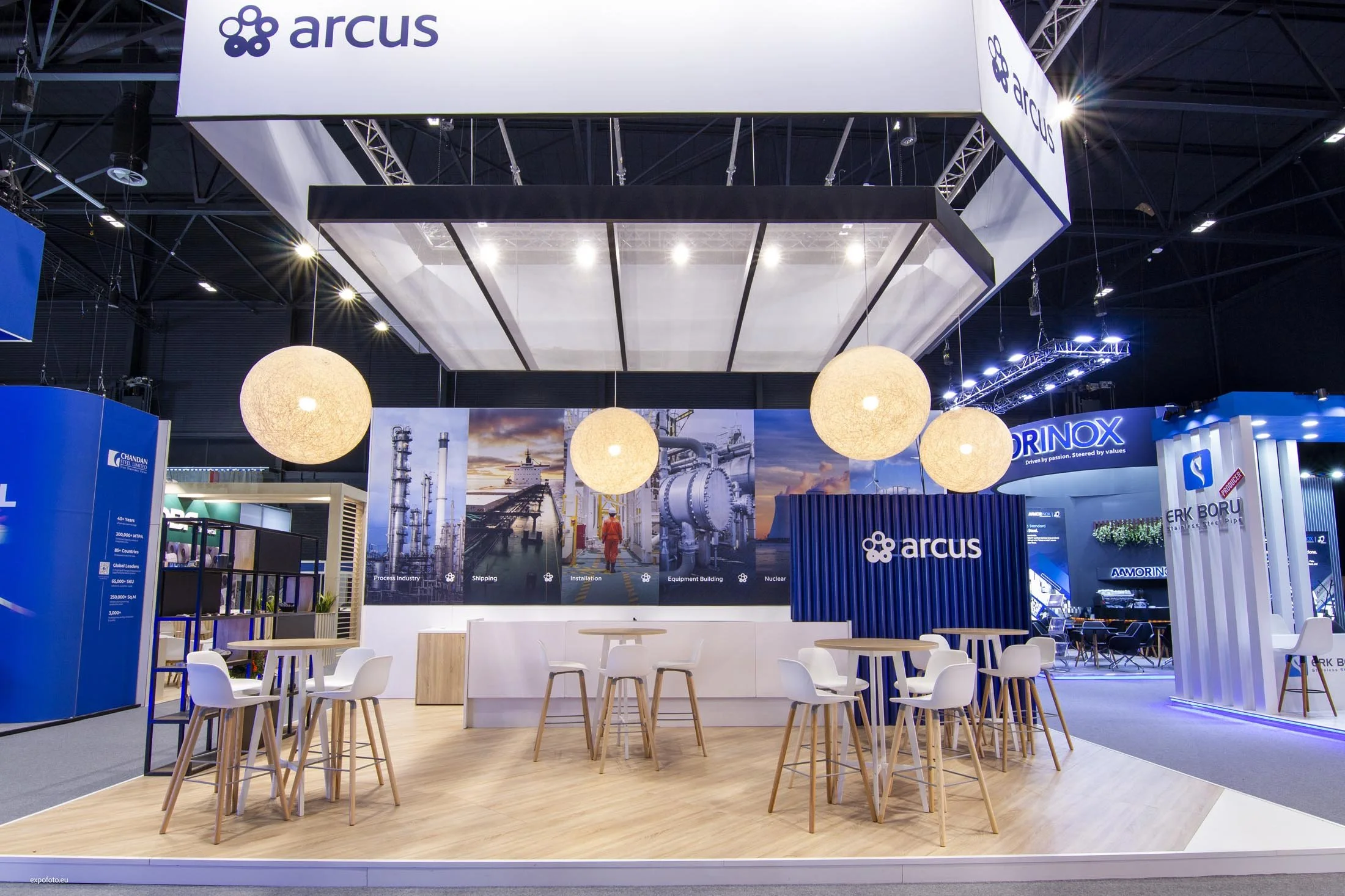
Arcus Group tradeshow booth
This transformation marks a new chapter for Arcus: clearer, stronger, and more unified than ever. It’s more than a new look, it’s a visual representation of who we are, what we stand for, and where we’re headed.
And we’re not stopping here. Throughout 2026, we’ll continue rolling out our rebrand across all touchpoints and keep developing our identity, making Arcus even stronger, more connected, and even clearer for everyone we work with.
Follow us on LinkedIn and stay updated on all Arcus Group developments.